留下 Email
成為類聚之友
成為類聚之友
不定期取得類聚第一手資訊!課程、活動與免費資源!

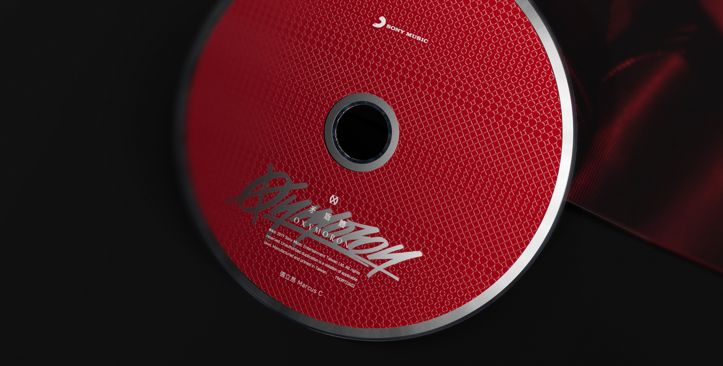
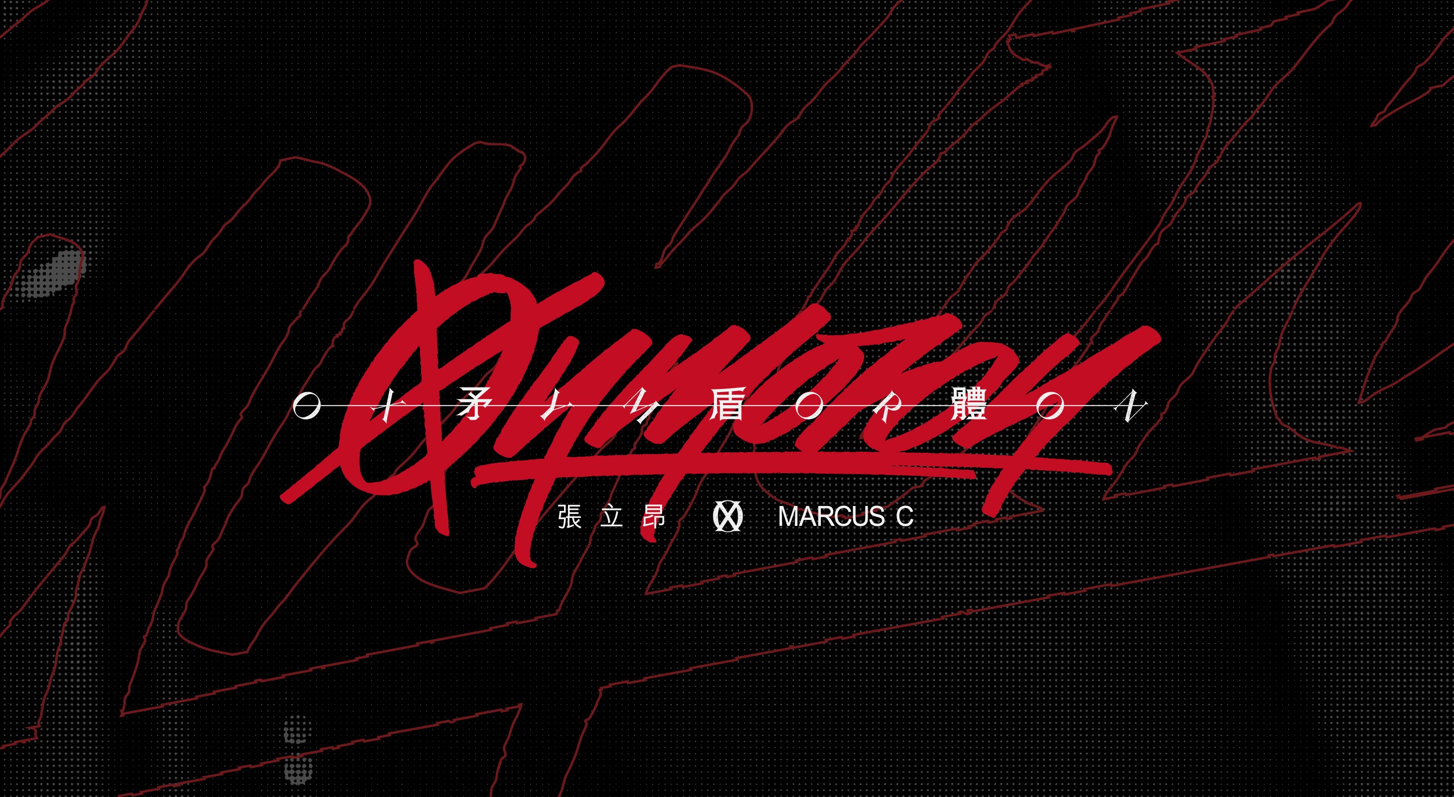
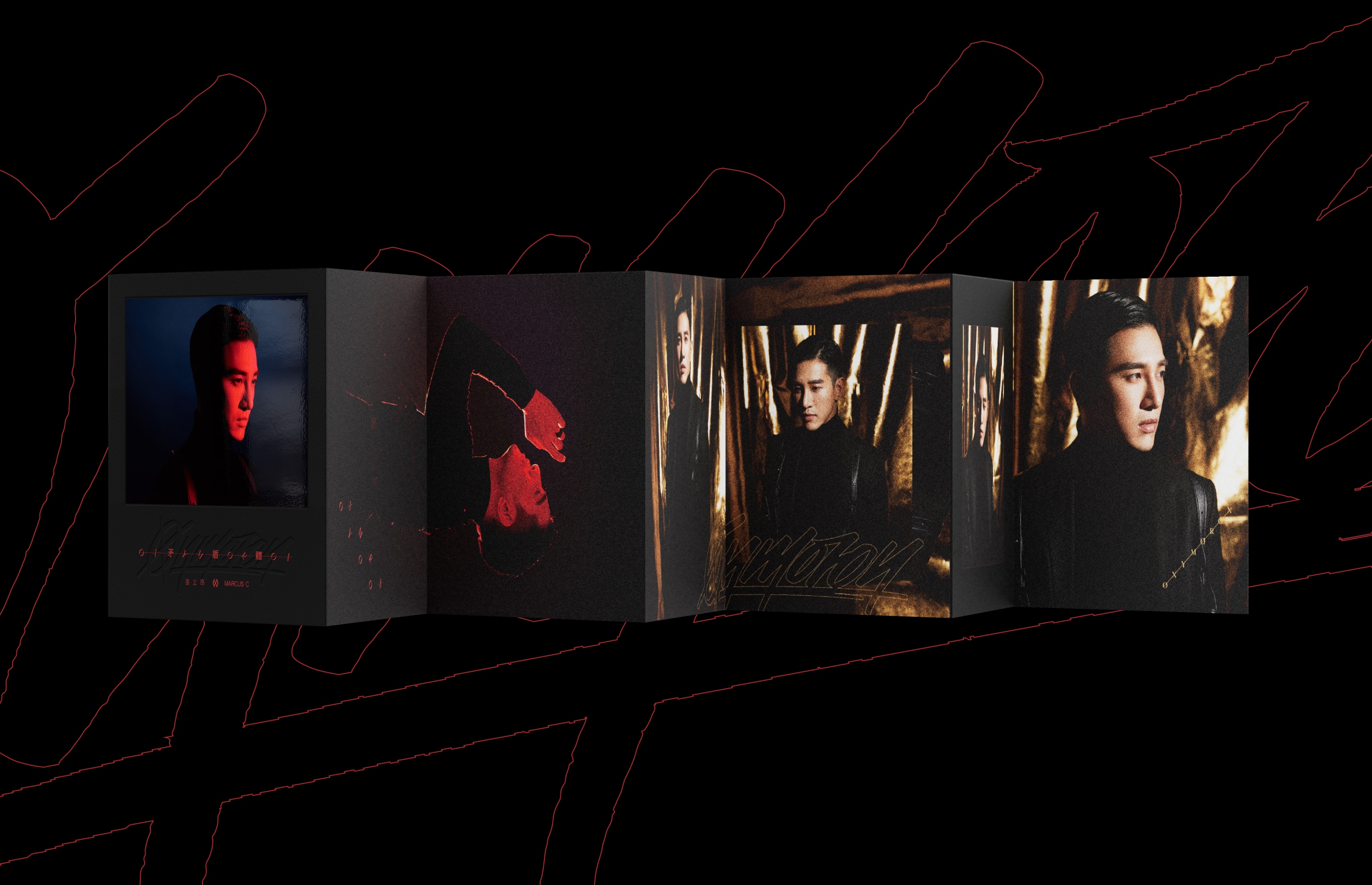
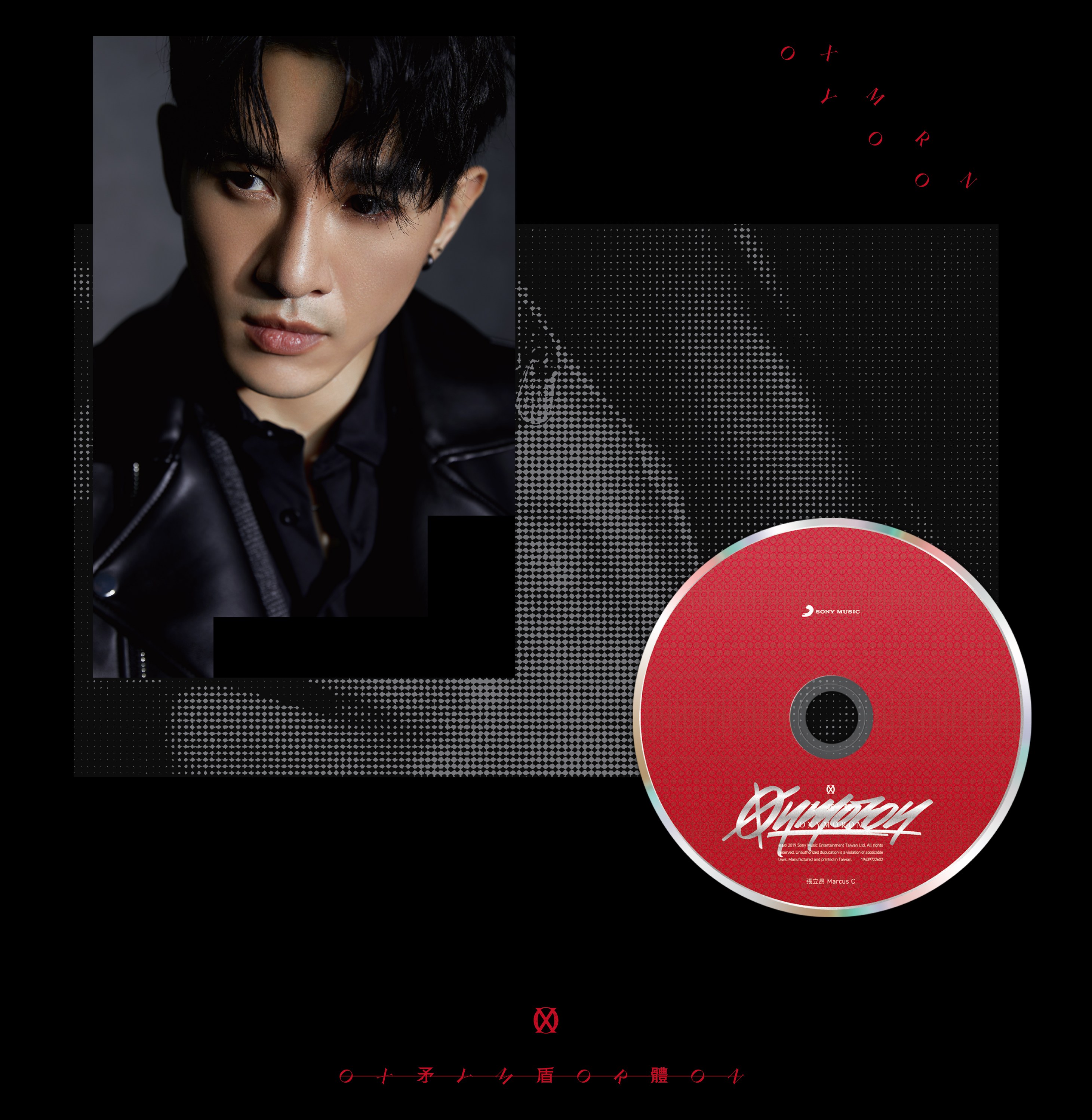
類聚與索尼音樂於 2020 年的專輯設計合作「Oxymoron 矛盾體」
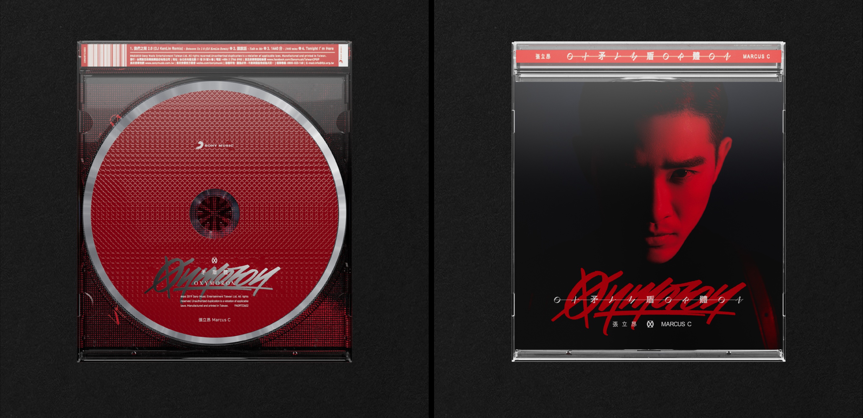
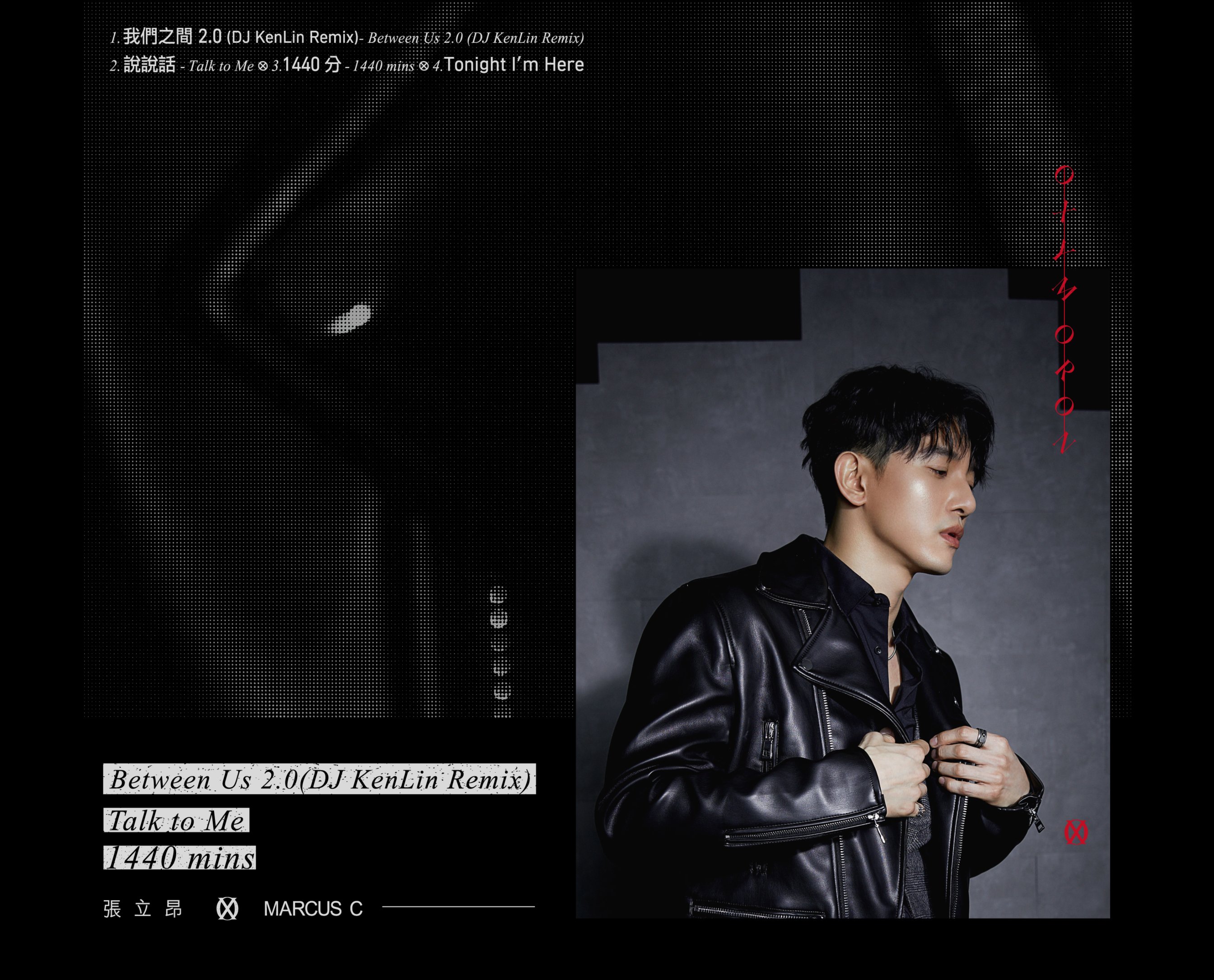
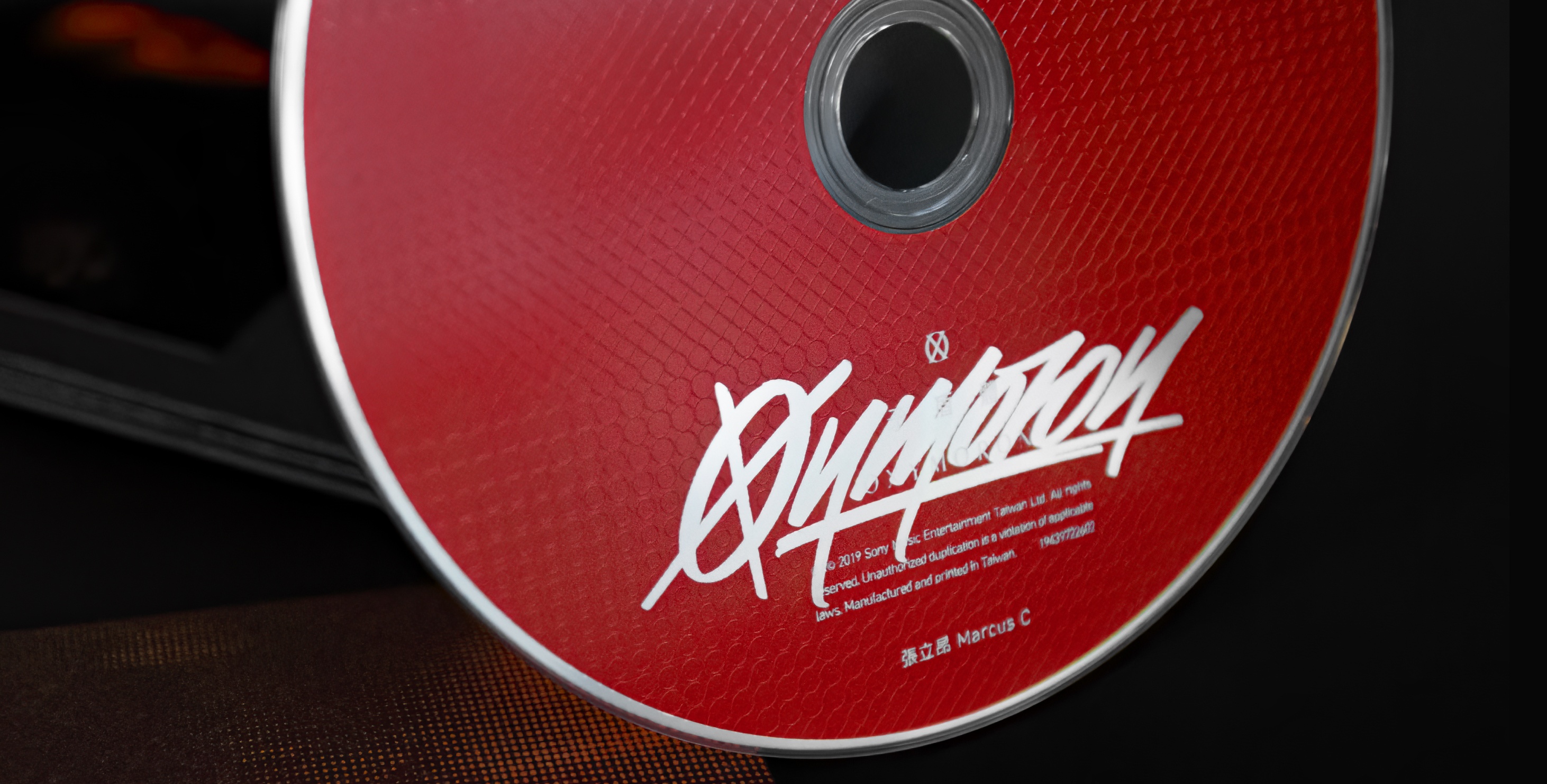
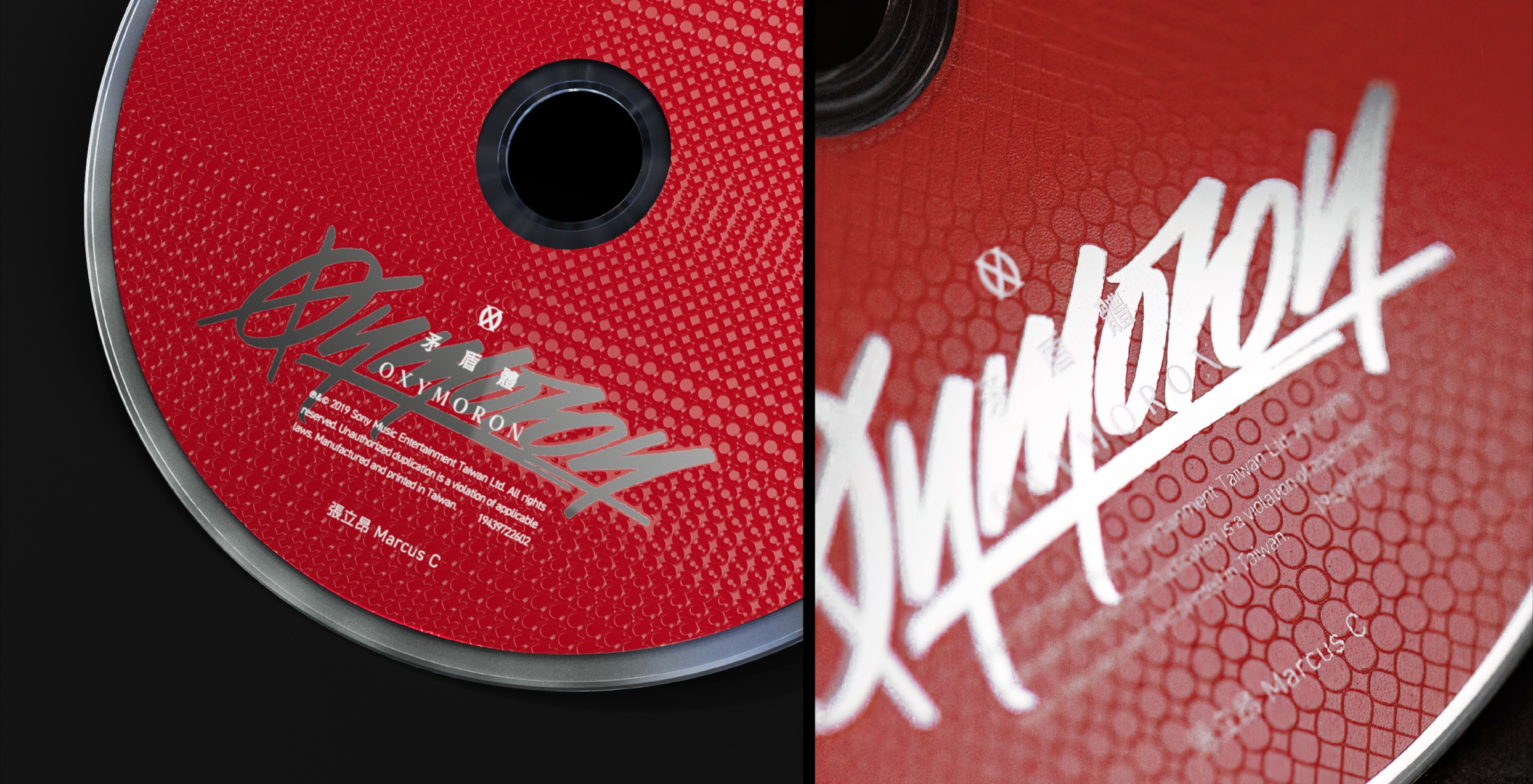
由專輯名稱的「O」與「X」作為代表矛盾的符號,
並以手寫字體表現不安於現況的叛逆,
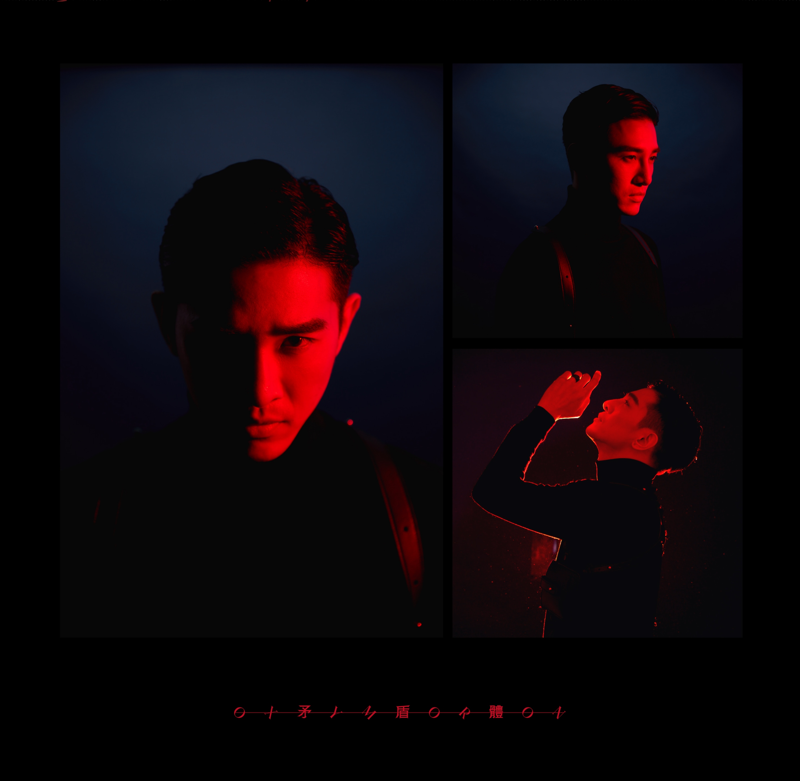
表現出歌手形象與真實自我產生的矛盾拉扯。
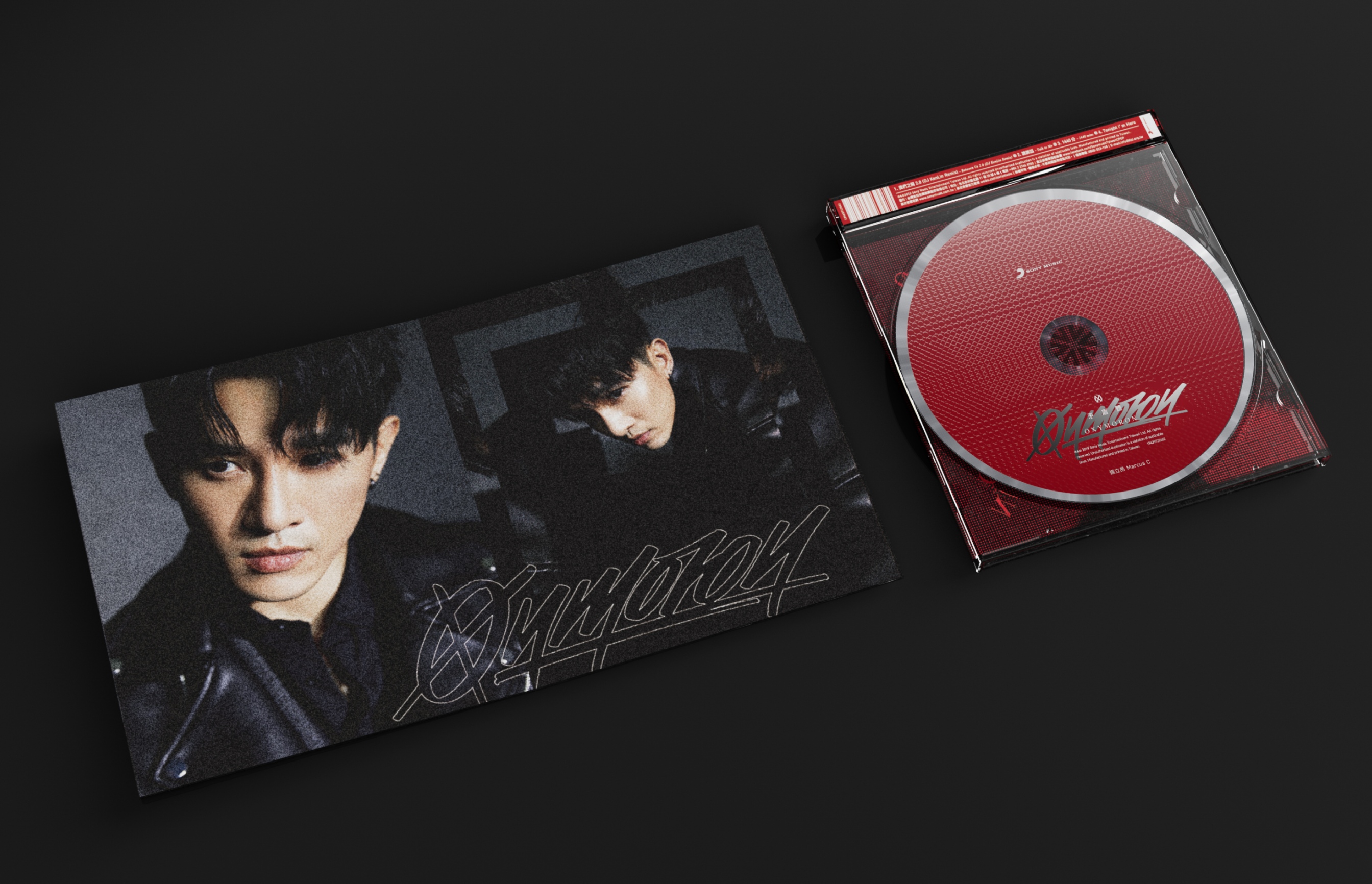
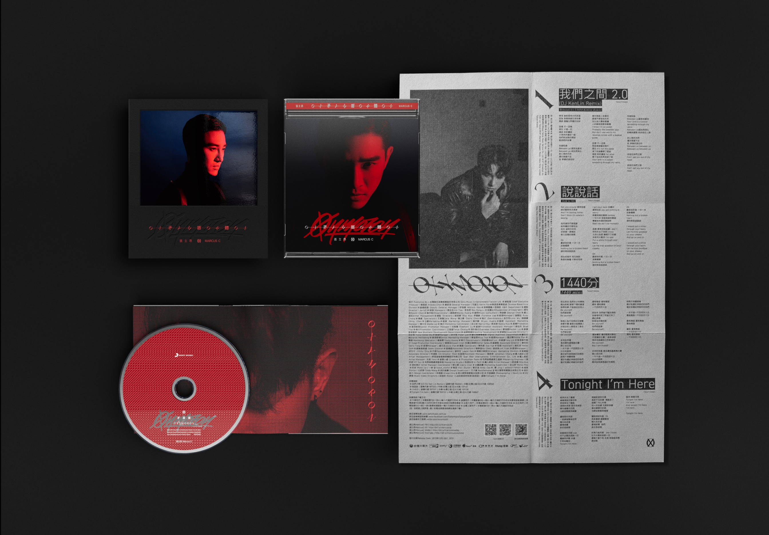
專輯裝幀突破傳統膠殼擺法,將CD反放並除去下標,
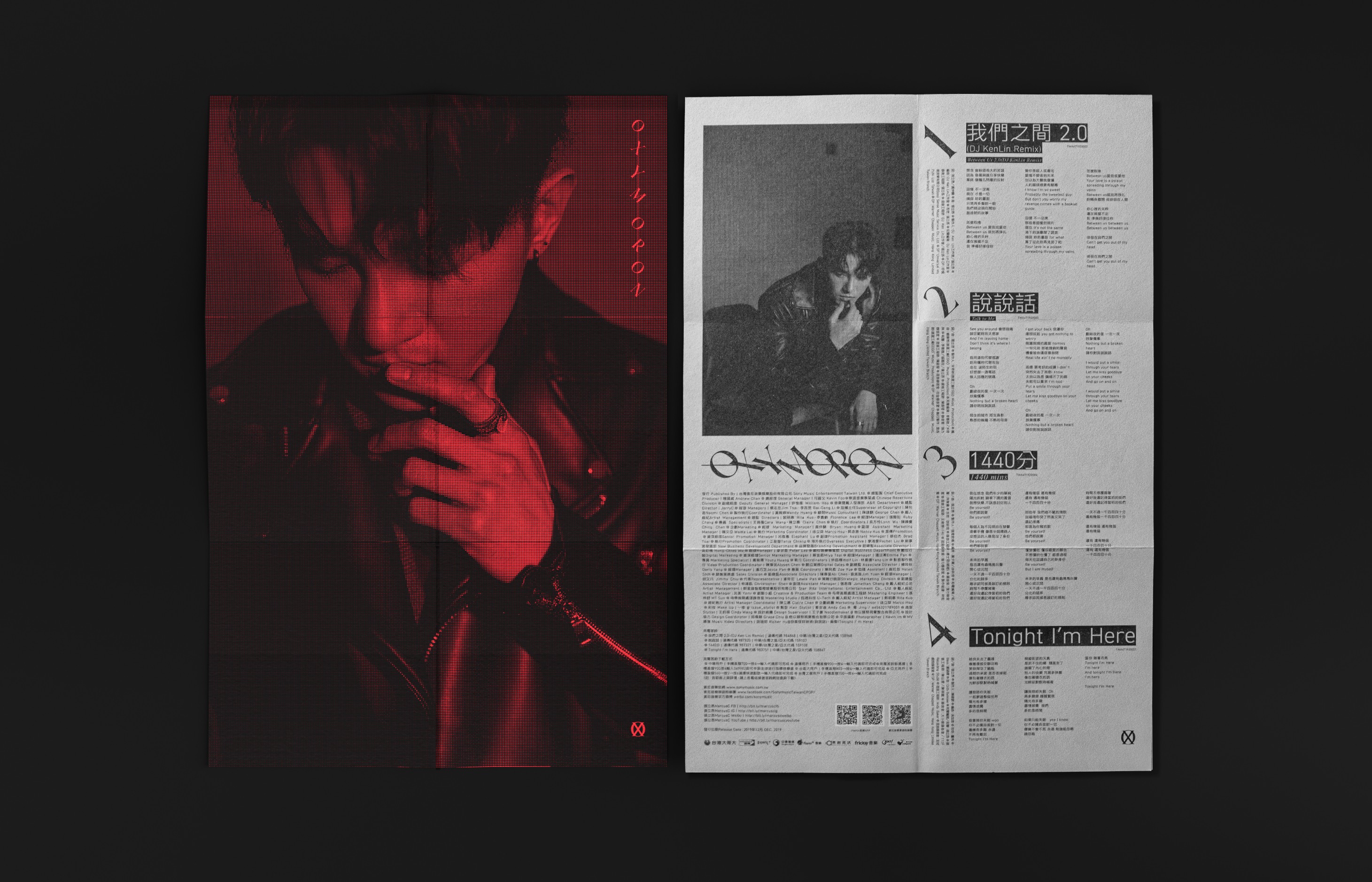
讓CD正面騰空於歌詞海報上,凸顯CD上「OX」符號的圖地反轉概念;
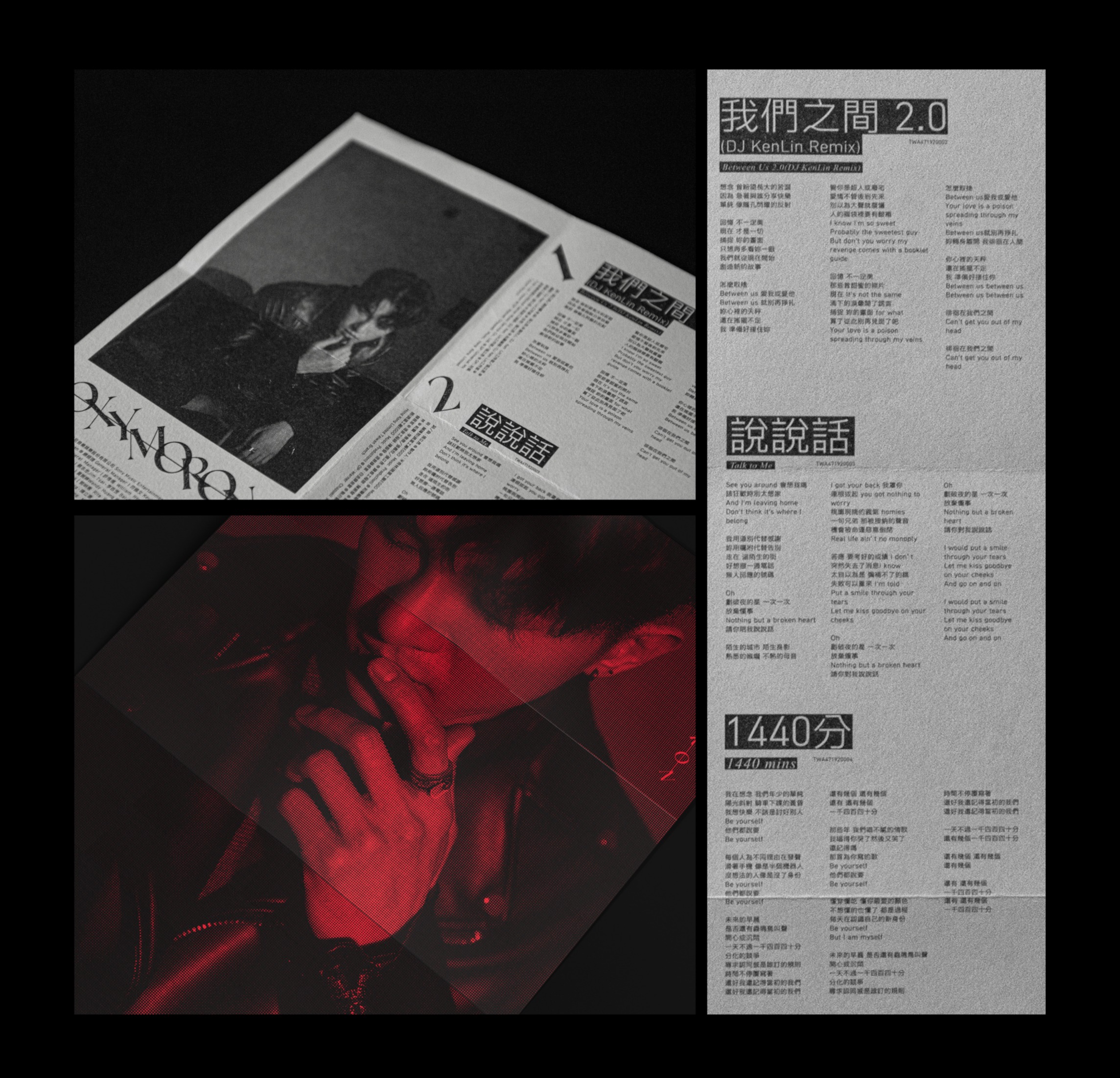
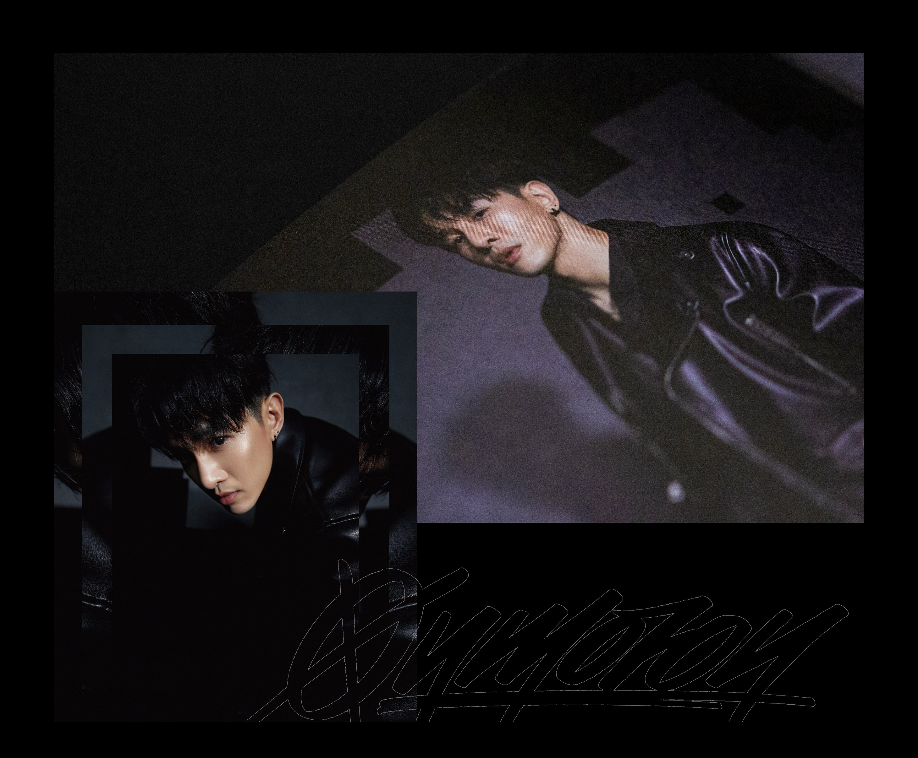
歌詞海報使用特殊色網點印刷於手抄感強烈的山彥奉書紙張上,
讓形象照與粗糙手感形成強烈對比。
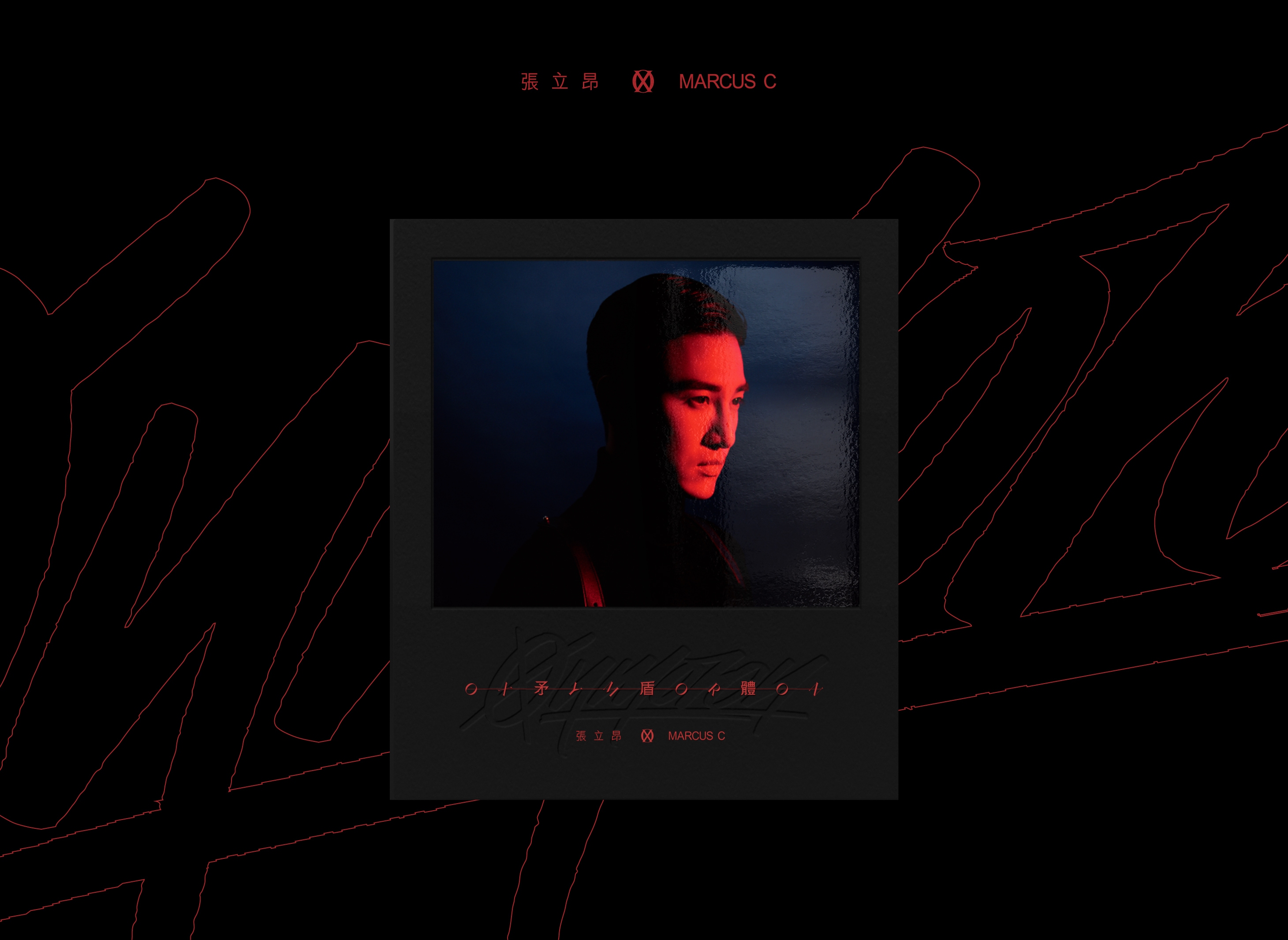
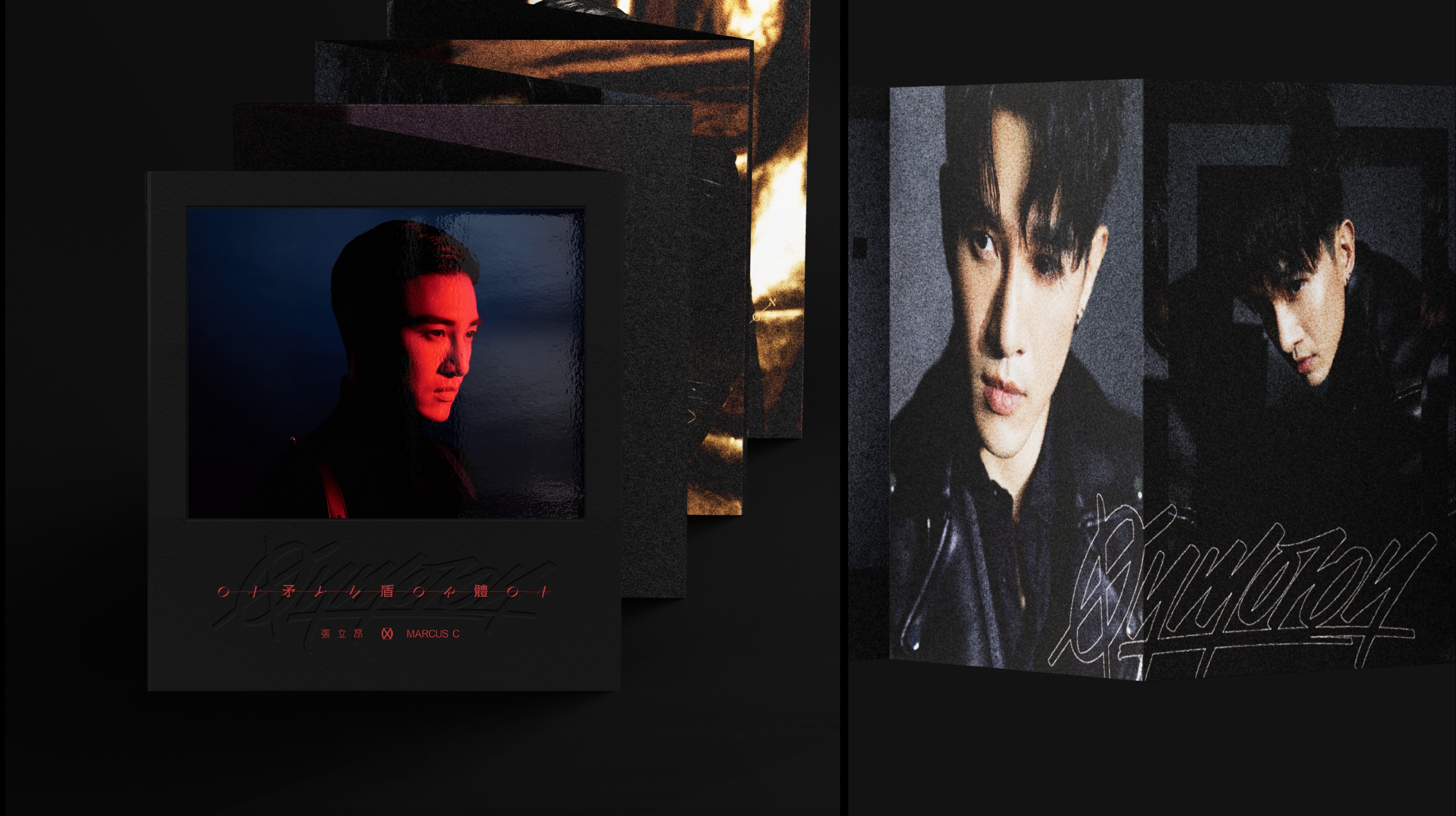
寫真書由厚磅黑卡作為封面,
透過貼紙對貼、打凹及網印等加工呈現手作質感,
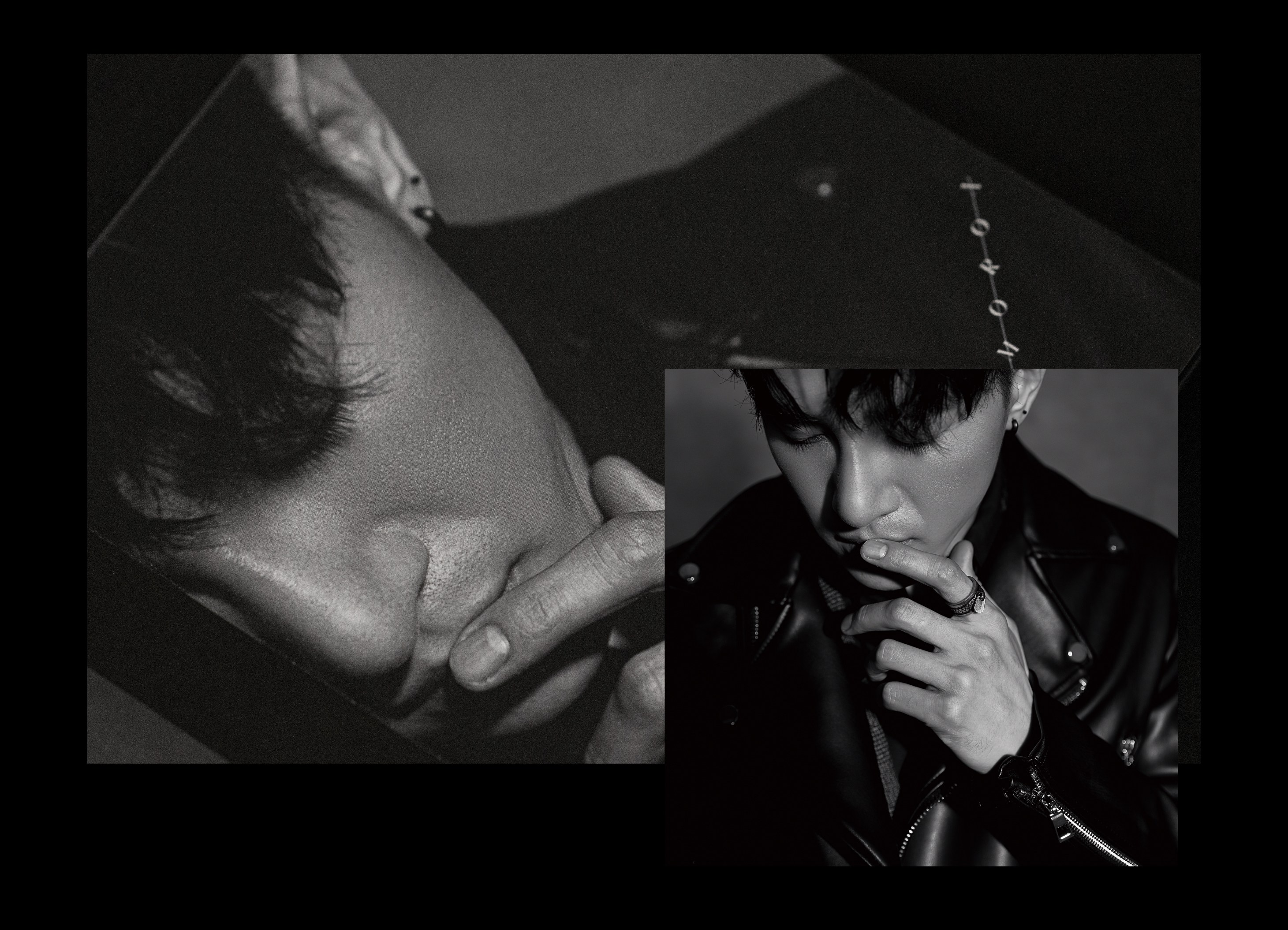
對夾N字折內頁,將歌手兩種不同的造型區分開來,
讓歌迷朋友能用兩種意境來體會矛盾體的創作概念。
In 2020, Grandvity Design collaborated with Sony Music on the Oxymoron album. This innovative album design utilizes the 'O' and 'X' symbols to convey a theme of contradiction, with rebellious handwritten fonts symbolizing the conflict between the artist's public image and true self.
The packaging breaks free from conventional CD cases, featuring a reversed CD hovering over a lyrics poster, emphasizing the 'OX' concept. The lyrics poster is printed on rough, handmade paper with a unique halftone pattern, compellingly contrasting the high-quality artist's photos. With its textured black card stock cover and 'N-fold' layout, the photo book distinguishes the artist's two looks, allowing fans to explore the concept of contradiction from different angles.

Client | 索尼音樂 Sony Music Taiwan CPOP
Production | 物以類聚視覺整合 Grandvity Design
Marketing Supervisor | 徐小桀 Marco Hsu
Art Director | Noodlemaker
Account Manager | Grape Chiu
Project Manager | Grape Chiu
Design Director | Si Jia Sun
Logotype Designer | Noodle Wang
Album Designer | Noodle Wang
Portfolio Designer | Si Jia Sun
Album Photography | Kaizer Zhuang